
Wear the corruption
Missing Output
Overview
Missing Output is a streetwear brand inspired by the glitches, errors, and distortions of retro tech. Drawing from the aesthetics of CRT monitors, corrupted files, and scratched discs, the brand turns visual failure into identity. It’s a celebration of broken systems, digital noise, and the beauty in what’s not working as intended.
Services
Branding
Software
Adobe Photoshop, Adobe Illustrator, Blender, After Effects
Problem
Many streetwear brands reference retro tech by lazily remixing old logos—like swapping their name into the Dell or PlayStation logo—without adding anything new. It’s nostalgic, but not creative.
Solution
Missing Output challenges this trend by building an original visual system inspired by glitches, analog errors, and the raw beauty of malfunction—turning failure into style with intention.
Mission Statement:
We make clothes for people who’ve crashed, glitched, and kept going. Missing Output is about wearing the error code with pride—channeling broken tech, corrupted memories, and analog weirdness into something real. No fake nostalgia, no bootleg logos—just original design for those who find beauty in the mess.

Origins
In exploring the intersection of fashion and retro tech aesthetics, I found that many existing brands approach the space with a surface-level understanding. Common trends include mimicking outdated logos—like replacing brand names with a twist on classic tech giants—or slapping pixel art on basics with little thought beyond nostalgia.
While these efforts nod to the past, they often lack depth and originality. Very few brands commit to the distortion itself—the glitches, errors, and fragmentation that defined analog media and early digital experiences. Instead, most rely on clean, templated designs that feel more like a retro costume than a genuine aesthetic.
The result is a wave of designs that feel more kitsch than cool—missing the grit, unpredictability, and chaos that made old tech visually interesting.
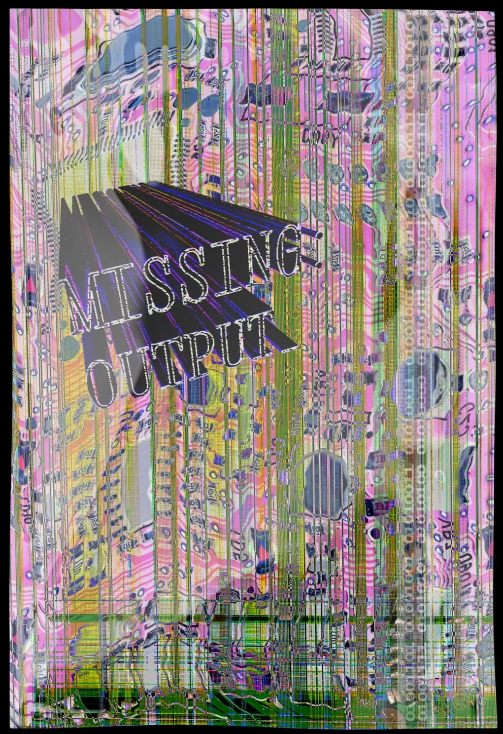
Wordmark Development
The Missing Output wordmark draws from code layouts, terminal interfaces, and monospaced typefaces. Inspired by system defaults and error screens, it reflects the brand’s digital roots without relying on forced glitch effects. The result is a wordmark that feels native to a broken system—clean, mechanical, and slightly off.

Clothing Designs
Each Missing Output shirt captures a unique visual glitch tailored to different subcultures. One features the chaos of cascading pop-up windows, evoking the feeling of a system on the brink. Another shows an unplugged CRT TV displaying the message “They turned the signal off but we are still here,” reclaiming presence in the face of silence. A warped RGB anime girl blends digital distortion with pop influence while the final design dives headfirst into digital noise—a splash of dithered interference and tonal distortion, layered with fragmented text. Together, the collection turns system failure into visual identity.

Visual Graphics
The visuals behind Missing Output extend the brand’s glitch-heavy identity through layered, chaotic media. Rough 3D scans of the shirts were used intentionally, embracing imperfect renders and scan artifacts. A 3D version of the wordmark was textured with looping flame GIFs—echoing early web aesthetics and low-res animations. Supplementary visuals included datamoshed photography, creating frames that feel corrupted mid-transition. Each graphic reinforces the brand’s core theme: embracing the raw, unstable nature of digital media in motion.


Package Design
Poly mailer bags were chosen for their versatility—serving both as in-person shopping bags and durable shipping packaging. The design pushes experimental boundaries, featuring heavily distorted circuit board imagery, screen tearing, and hyper-saturated color treatments. These effects bleed into the 3D form of the logo wordmark, creating a package that feels like a glitched transmission—visually unstable, yet unmistakably part of the Missing:Output system.

Hangtags
The hangtags were designed to reflect the brand’s fragmented identity. One side simulates a missing texture—mimicking the default error pattern seen in broken 3D assets—with the logo subtly embedded into the glitch. The reverse side features clean, minimal type laid out like lines of code, reinforcing the brand’s tech-rooted concept through structure and simplicity.


Social Media
To promote the release of each shirt, teaser videos were created using rough 3D models of the garments. These models were imported into After Effects and further distorted to enhance their broken, digital feel. Scrolling text layered over the footage created a trance-like rhythm—reinforcing the brand’s hypnotic, signal-lost atmosphere and keeping the visuals in sync with Missing:Output’s glitch-heavy identity.
Merch Site
The website served as the final layer of the experience—bringing all elements together in a way that felt true to the era. Designed to resemble an archaic early 2000s site, it featured a cheesy 3D wordmark, spinning shirt previews, and a layout that felt more like a broken portal than a modern shop. It was important that the site didn’t just sell the pieces—it extended the glitch, completing the narrative.

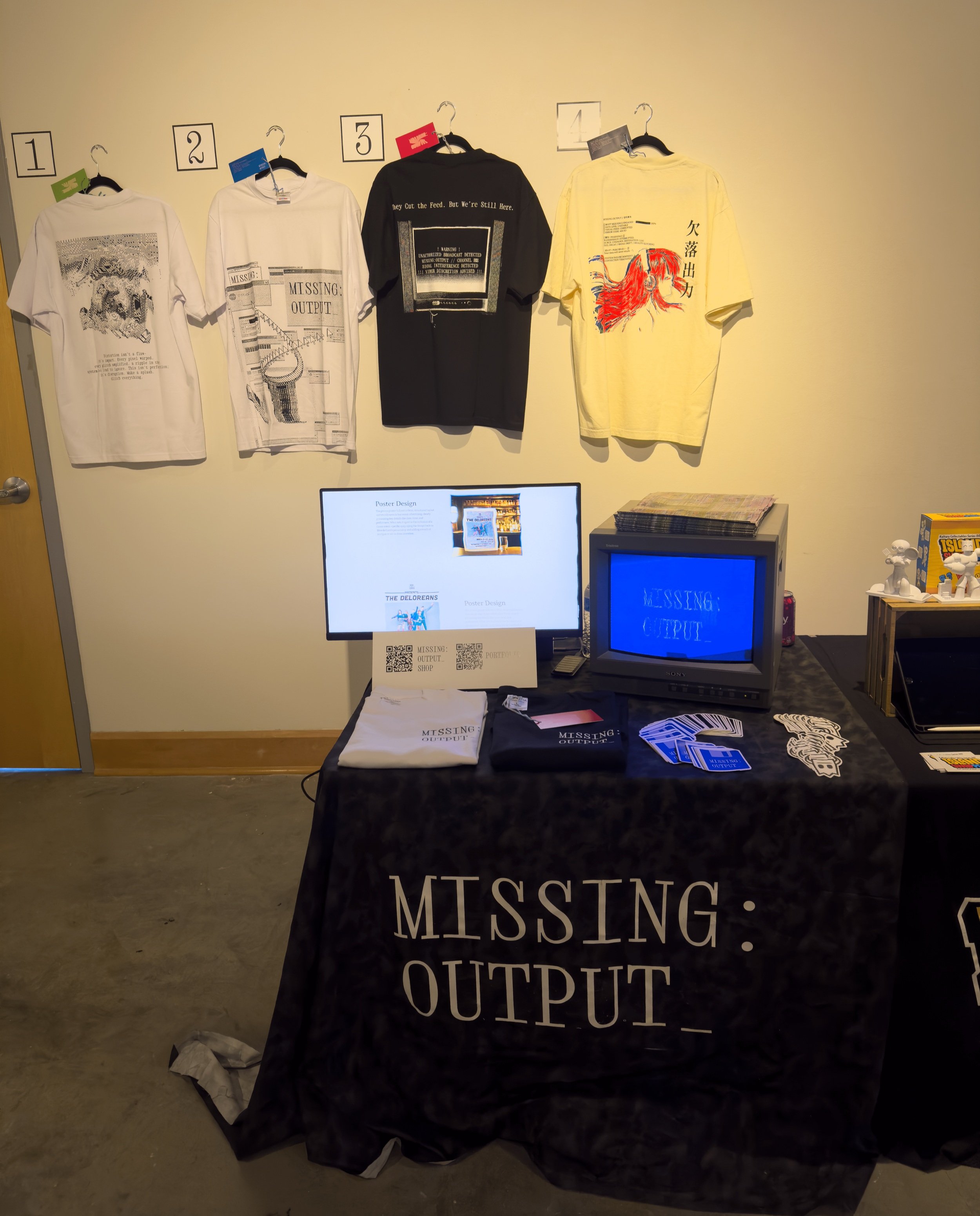

Photo Creds: Kaila TomitaCapstone Gala
The final capstone gala was the moment to bring Missing Output into the physical world. It served as a curated booth space where all elements of the project came together. Shirts were on display, stickers were available to take, and a portfolio video played on loop to showcase the process and concept. Visitors could interact with the brand firsthand, ask questions, and even purchase pieces, turning the digital distortion into a tangible experience.
Loading Screen
During the gala, a CRT TV played a custom loading screen inspired by the classic DVD bounce animation with a distorted twist. The display flickered with broken visuals and digital noise, showing warped shirt graphics drifting across the screen. They bounced unpredictably from edge to edge, often glitching or disappearing entirely. This set the tone for the booth experience, creating a sense of nostalgia and unease that aligned perfectly with Missing Output’s celebration of visual error.
Takeaway
Working on Missing Output was one of the most fulfilling parts of my design journey so far. It gave me the space to fully flesh out a brand that feels alive and expandable, something I can continue to build on in the future. The physical deliverables came together successfully, and the project opened up new possibilities for growth, from creating more video content to launching a newsletter and expanding its presence across social media. This is not a finished brand—it is the beginning of an evolving system.
