A Dive Bar with a Twist of Elegance
Dive de Coco
Overview
Dive de Coco is a unique take on the classic dive bar, blending the raw, welcoming atmosphere of a neighborhood staple with the rich storytelling of Latin American folklore. Designed as an escape for parents and adults looking for a refined yet relaxed night out, this bar offers a setting where legends and libations intertwine.
Services
Branding
Software
Adobe Photoshop, Adobe Illustrator
Problem
Parents and working professionals deserve a place to unwind that feels effortless but still offers depth—both in ambiance and experience.
Solution
Dive de Coco bridges this gap by crafting a space where folklore, comfort, and elevated drinks come together, offering a night out that feels both familiar and intriguing.
Mission Statement:
At Dive de Coco, we create more than just drinks—we craft an experience where culture, storytelling, and atmosphere come together. Inspired by Latin American folklore, our bar offers a refined yet inviting space for adults to escape, indulge, and enjoy the night they deserve.

Origins of El Coco
El Coco is a legendary figure in Latin American folklore, often used by parents to encourage children to sleep early. If they disobey, El Coco is said to snatch them away from under the bed or closet, reinforcing his role as a boogeyman-like entity. What makes El Coco unique is his lack of a fixed form—his appearance shifts across cultures and regions, sometimes depicted as a shadowy ghost, a monstrous lizard, a fearsome dragon, or even a coconut with eerie features. Despite his ominous origins, El Coco remains a deeply embedded figure in folklore, evolving over time while continuing to embody the fears and mysteries of the night.
Early Logo Development
The initial logo exploration focused on quick sketches and conceptual variations of El Coco’s many forms, drawing inspiration from his diverse depictions across Latin American folklore. Early drafts experimented with ghostly silhouettes, reptilian features, and abstract coconut-inspired shapes, capturing the essence of his ever-changing identity.
Cocktail Concept
This phase allowed for a broad exploration of visual language before refining the concept into a more polished and sophisticated representation of El Coco as the bar’s dapper yet mysterious host.

Menu Research
To shape a menu that felt elevated yet approachable, research drew inspiration from Gershwin’s (Norfolk, VA) and Artillery (Savannah, GA) for their refined cocktails and distinctive ambiance. These spots informed the creation of a drink menu with character, not pretension. For food, LeGrand Kitchen (Norfolk, VA) influenced the focus on thoughtfully prepared, comforting dishes that complement the bar’s atmosphere. Together, these references helped craft a menu that supports Dive de Coco’s identity—flavorful, balanced, and full of personality.
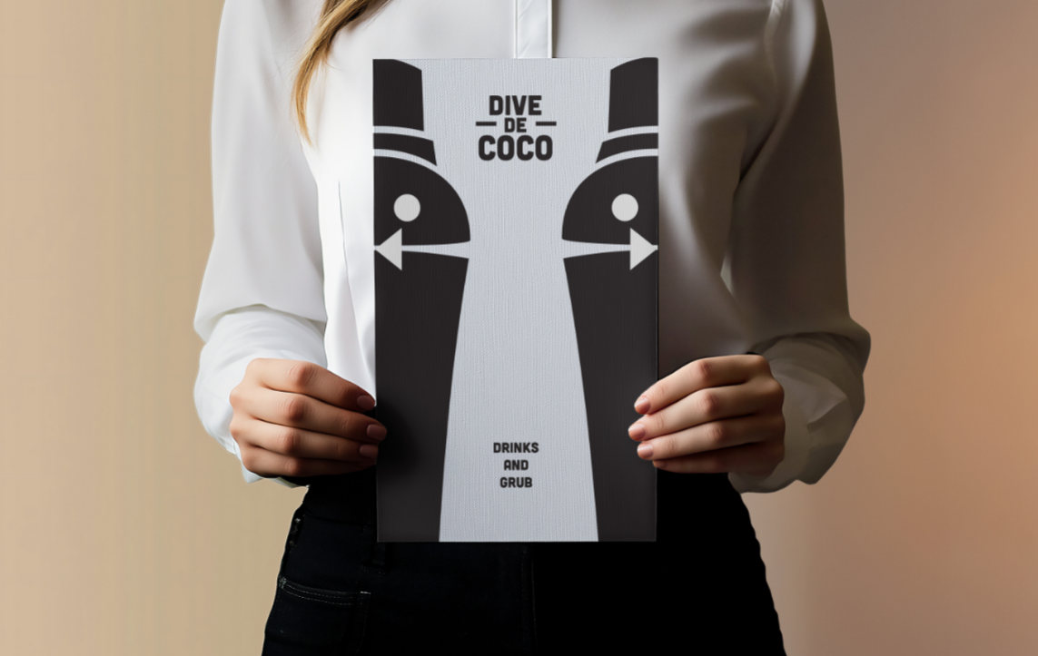
Finalized Concept
In the final logo, El Coco takes on a new identity as a dapper figure shaped like a cocktail shaker—a nod to his folkloric origins and the essentials of bartending. This form makes him both a symbol of the bar’s mythic charm and its elevated cocktail experience, turning a childhood legend into the bar’s iconic host.


Font Exploration
Multiple typefaces were tested to find one that felt appropriate for the brand—bold enough to stand out, but still warm and approachable
Finalized Font Choice
The Cubano typeface was chosen and carried through the final design due to its bold presence and smooth curves, striking a balance between clean professionalism and inviting warmth. Its rounded forms give the brand a friendly, approachable feel, while still maintaining the strength and clarity needed for a standout bar identity.


Layouts
Various text layouts for the Dive de Coco wordmark were explored to find a balance between readability and visual harmony with the logo. Different alignments and arrangements were tested to ensure the text complemented El Coco’s form while maintaining a strong, cohesive brand presence across applications.
The Wordmark
The wordmark features a center-aligned, tiered design that emphasizes visual hierarchy and flow. The varied sizing and balanced placement create a strong rhythm, while the dashes add subtle detail that enhances the identity without overpowering it. This approach reinforces the brand’s unique tone—structured yet playful.

The Menu
Drawing inspiration from the offerings at Gershwin’s, Artillery, and LeGrand Kitchen, the menu was crafted to align with Dive de Coco’s refined yet relaxed tone. Food and drink names were shaped with a Spanish influence and a subtly morbid twist, reflecting El Coco’s eerie folklore roots while adding a distinctive personality to the overall experience.
Staff Attire
The chosen attire for the kitchen staff is a sleeveless chef jacket, offering a balance between professionalism and comfort. It provides more mobility than a traditional full-sleeved jacket, making it practical for a fast-paced environment, while still appearing more polished than a standard t-shirt—a perfect fit for Dive de Coco’s elevated yet laid-back atmosphere.

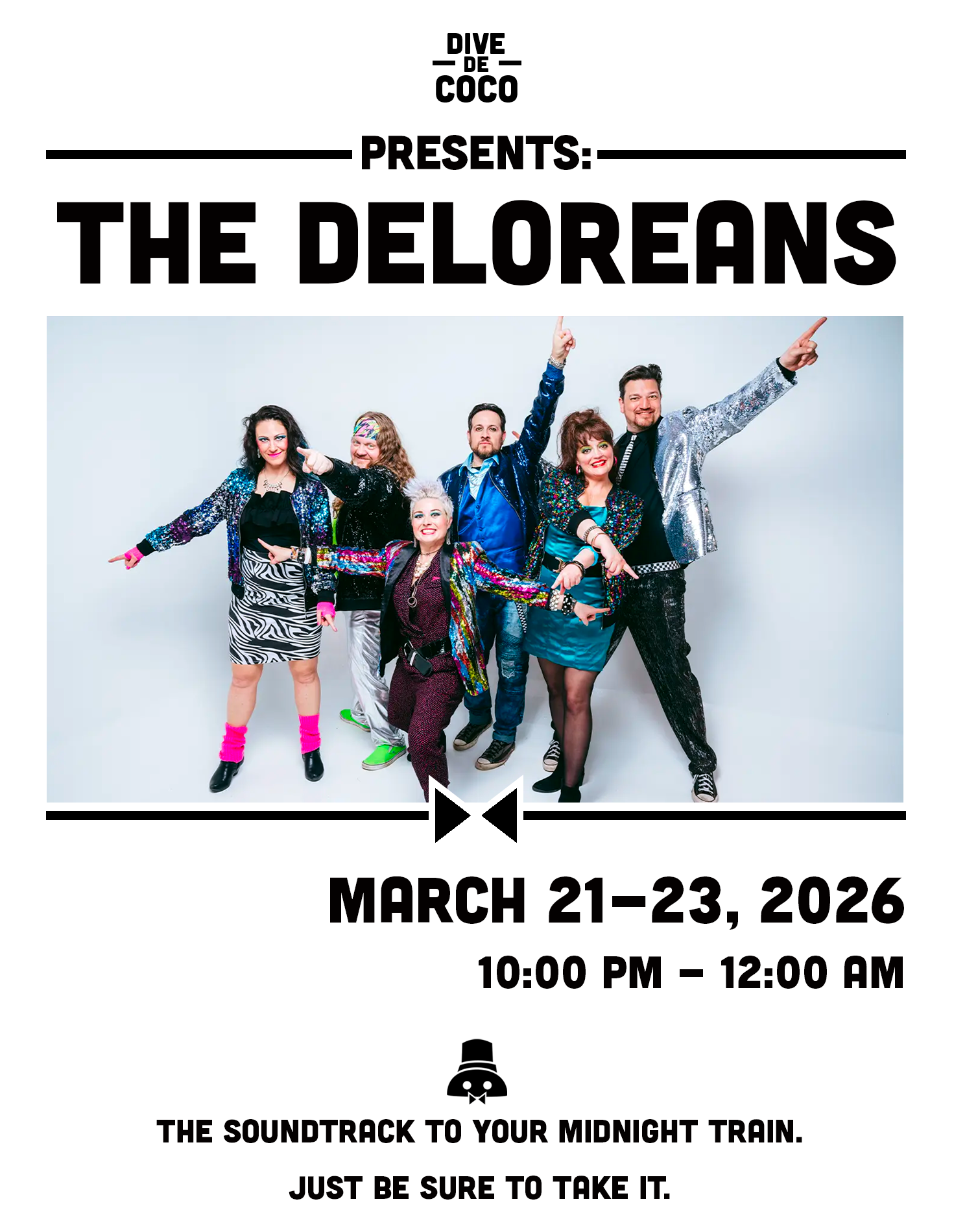
Poster Design
The promo poster follows a clean, structured layout commonly seen in bar event advertising, clearly presenting key details like date, time, and performers. What sets it apart is the inclusion of a clever event-specific quip, tying the design back to Dive de Coco’s personality and adding a touch of intrigue or wit to draw attention.
Takeaway
Dive de Coco gave me the opportunity to celebrate my Mexican heritage through a more refined design lens. By stepping away from texture-heavy visuals, I learned how to convey depth and personality using cleaner aesthetics, thoughtful details, and cultural storytelling, creating a brand that feels both meaningful and visually mature.
